Comfort Tincture – Boxes
January 11, 2024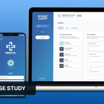
Alpha Dapp
January 29, 2024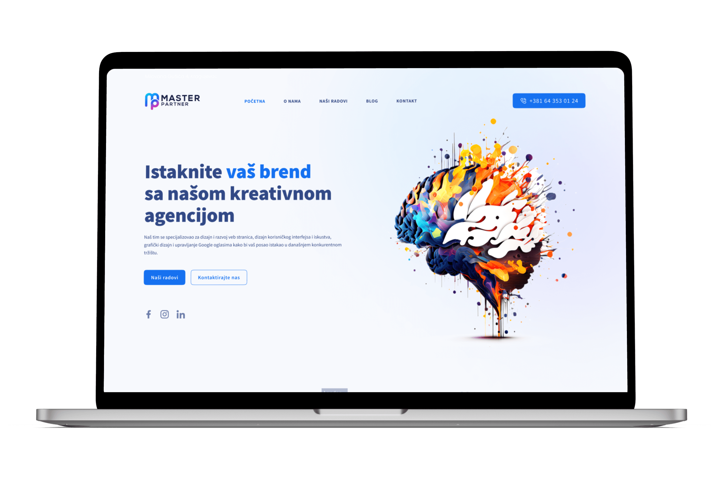
Master Partner - Website Redesign
Project Overview 🚀
The project centers on the redesign of the landing page for MasterPartner, a creative agency. The existing website at masterpartner.rs required an uplift in user experience and visual design to better showcase the agency's services in web and graphic design, as well as Google ADS.
The Problem 🤔
Key usability issues were identified with the original landing page:
- Suboptimal information hierarchy, leading to potential user confusion.
- Inconsistent visual elements that could dilute the brand message.
- Lower than desired user engagement metrics.
- Call-to-action elements not effectively highlighted.
- Services offerings were not immediately apparent to visitors.
The Solution 💡
Key usability issues were identified with the original landing page:
- Suboptimal information hierarchy, leading to potential user confusion.
- Inconsistent visual elements that could dilute the brand message.
- Lower than desired user engagement metrics.
- Call-to-action elements not effectively highlighted.
- Services offerings were not immediately apparent to visitors.
Information Architecture 📋
A structured information architecture was developed:
- A top-down layout with a clear header leading to detailed service sections.
- A grid-based layout for an organized display of services.
- Integration of testimonials to build trust and highlight the agency’s success
Value of the Project 🌟
For the user:
- An enhanced experience when exploring services.
- Immediate access to critical information and services.
- An informative blog section providing additional value.
For the product:
- An uplifted brand image and increased credibility.
- Improved metrics for user retention and conversions.
- An effective showcase of the agency’s portfolio to attract more business.
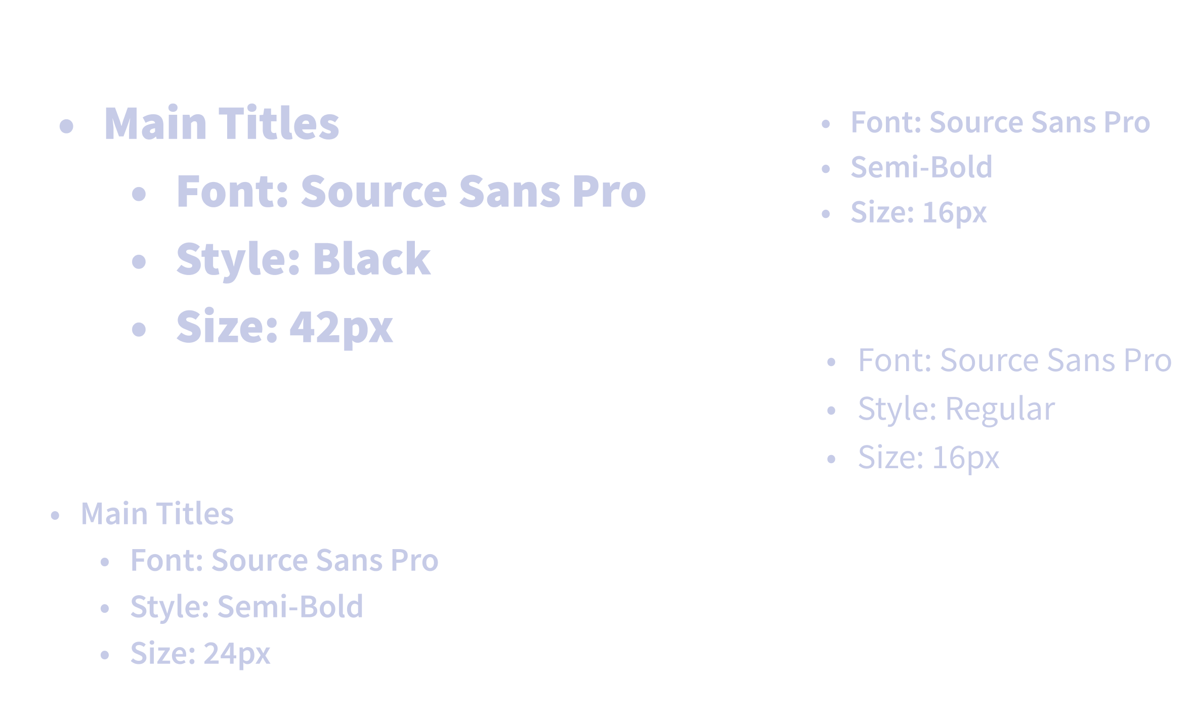
Typography 🔠
The redesign of the MasterPartner website employs Source Sans Pro as its cornerstone typeface, a decision that underpins the clarity and legibility of the website’s content. This typeface was chosen for its modern and approachable character, which aligns seamlessly with the brand's identity and the functional requirements of the website.
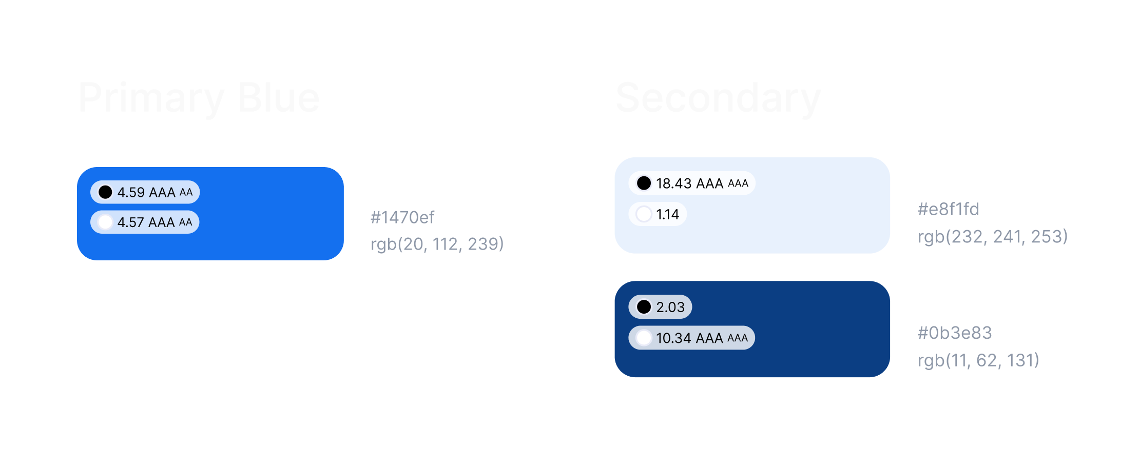
Colors 🎨
UI Design 📱
The UI design emphasizes a clean, modern look, with a focus on usability. It uses whitespace, typography, and color to guide the user visually through the agency's offerings, ensuring an intuitive flow from section to section.